UX Audit: Rethinking the Path to Support
Goal
Improve the effectiveness of the QuickBooks out-of-product support experience by addressing a critical UX issue: the underperforming Product Selector. The goal was to ensure users could easily identify their product and find relevant support content through a more intuitive and user-centered experience.
My Impact
As the E2E design lead, I conducted a full UX audit that included quantitative analysis, qualitative research, competitive benchmarking, and heuristic evaluation. I synthesized insights into a new information architecture and interface design, creating wireframes and high-fidelity mockups for a proposed product-first support model, aligning cross-functional teams around a unified solution.
What I delivered
- Only 3% of users interacted with the Product Selector (key baseline finding)
- 27% of users abandoned the support page entirely
- Proposed product-first redesign advanced to usability testing phase
- Potential to increase self-service success, lower support costs, and improve customer satisfaction
Persona
Most QuickBooks customers are small business owners who rely on QuickBooks to manage their finances, track expenses, and generate invoices. They value user-friendly tools that save them time and help them focus on growing their business. They need a platform that is intuitive, reliable, and offers real-time insights to make informed financial decisions.
Problem statement
I am... a QuickBooks Online customer
I am trying to… figure out how to do something within the product using self-help articles
But… I am not finding the right articles for my product
Because… the content is specific to the product and edition I own, which I do not know
Which makes me feel... frustrated and unsure, leading to a poor experience and a lack of confidence in the QuickBooks ecosystem especially around self-help resources.
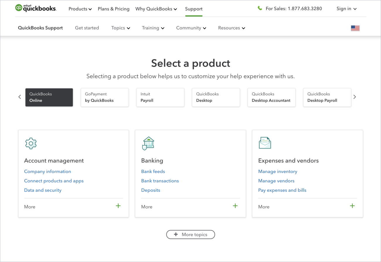
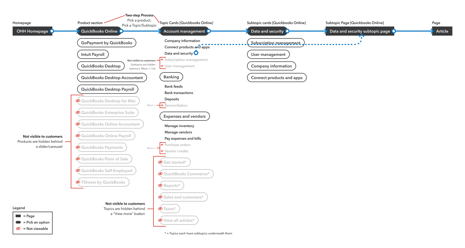
The issue with the Product Selector
The issue with the Product Selector on the QuickBooks out-of-product help site goes beyond the selector. It allows users to choose a product and browse related topics and subtopics, significantly influencing the entire customer experience.
Observations
- Only 3% of help page views involve a product selection.
- The Product Selector is a two-step process, and the selected product dictates navigation.
- Changing products is only possible at the topic level if the products share the same topic — otherwise, users must return to the Product Selector.
- The current information architecture prioritizes topics over products.
Using Foreign UI Patterns
The list of topics in the navigation changes based on the product selected in the product selector, and the only way to access new topics is by selecting a different product and then checking the navigation to see the updated options.
Baseline UX issues
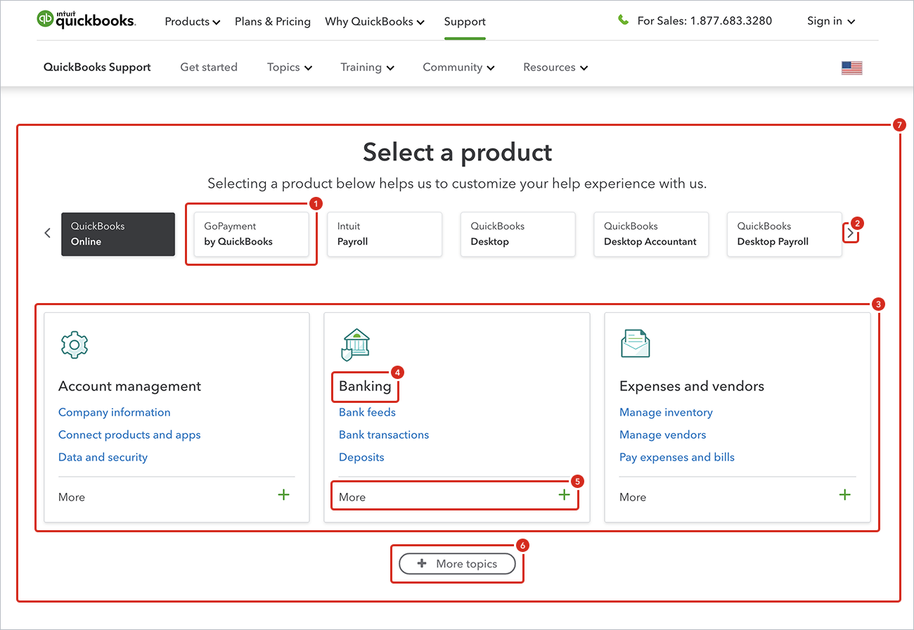
- Buttons as Product Selectors
The product selector uses a button-like treatment, but when selected, users are not taken to a new page; instead, the topic cards switch. This contradicts the widely known pattern that buttons should lead to new pages. - Ineffective Carousel
Only 0.01% of customers use the carousel arrows to scroll, hiding eight additional products. This low engagement rate makes the carousel an ineffective UI element. - Confusing Card Switching
Topic cards switch in and out based on the selected product, which can confuse users about why the elements on the page are changing. In some cases, cards do not switch at all, adding to the confusion. - Clickable Topic Names
Topic names are clickable but do not visually indicate this, appearing more like headlines. Only 1.8% of customers click on the topic names, suggesting a lack of clarity in their function. - More Link Usage
The "More" link is clicked by only 2.1% of customers. Some topics have only one extra subtopic, making the link unnecessary as it takes up the same amount of space. - Accordion Pattern Misuse
The "More Topics" button is actually an accordion pattern, which expands to show more topics. Users expect it to lead to a new page, but 90% of clicks on topic cards come from the top three cards, indicating that the rest are underutilized. - Two-Step Process
Users are forced into a two-step process: select a product, then pick a topic/subtopic. However, selecting a product is the most critical step, as it provides a customized experience across the product support microsite.
User flows
Currently, there is no way to select other topics except through the product selector. For example, a customer arriving on the support site to learn more about timesheet management might click on Topics in the navigation but won't find anything related because QuickBooks Online, the default selected product, does not offer this topic.
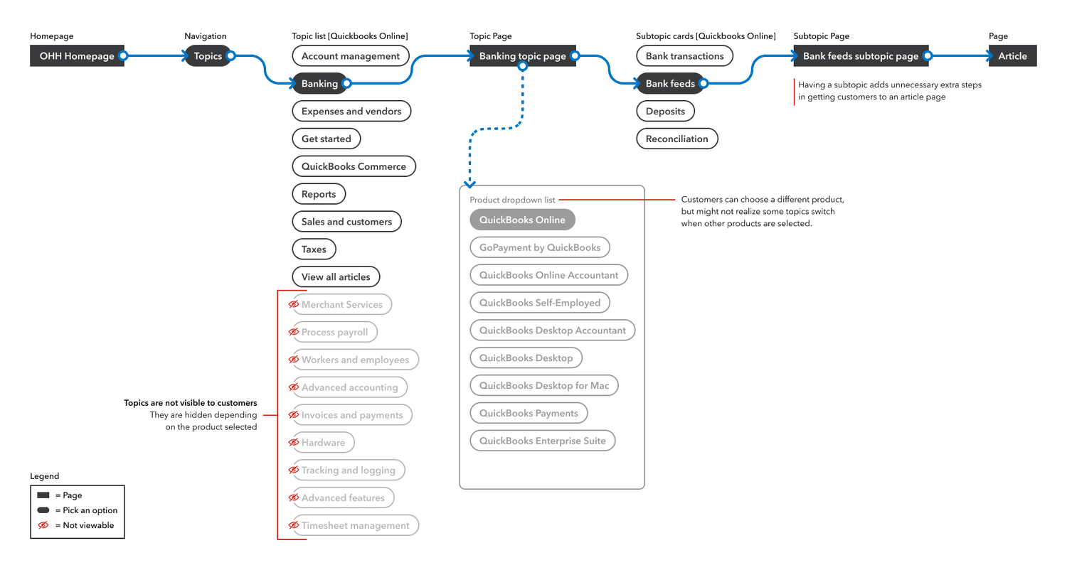
When on a topic page, only products that pertain to that topic are available. For instance, a customer arriving on the support site and clicking on the Expense and Vendors topic card might realize that QuickBooks Online was selected by default. When they try to change the product by clicking on the drop-down menu, they do not see their specific product listed.
How did we get here
In developing the product support site, the project involved an external agency as well as several in-house designers and project managers. This collaboration led to a lack of clear ownership over the strategy and UI/UX design. With so many contributors, the site ended up reflecting a variety of opinions and ideas, which couldn't be thoroughly iterated or tested due to the tight timeline. The site had to go live by a specific date, leaving little room for refinement and optimization.
The current user experience was tested using Usertesting.com, but the results were inconclusive and the test was not properly structured to ensure success. The test only included one variant, failing to compare multiple layouts to determine which performed best.
Quantitative research
In our recent analysis of the QuickBooks product support homepage, we uncovered several critical issues impacting user engagement and satisfaction:
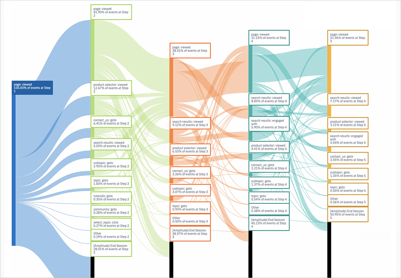
- 27% Abandon
Over a quarter of customers immediately leave without clicking anything else, suggesting confusion or overwhelm. - 18% Navigate Elsewhere
A significant portion use navigation items, footer, or other links, indicating the primary content is not guiding them effectively. - 17% Refresh
Over 17% click on the 'QuickBooks Support' link, which refreshes the page, showing they are lost or unsure. - 14% Carousel Interaction
While 14% engage with the product carousel, only 2-3% move on to click on a topic or subtopic, indicating the carousel is not effective. - 11% Search
About 11% use the search function, suggesting the primary navigation is not meeting their needs. - 8% Contact Us
Around 8% scroll to the bottom and click 'Contact Us,' indicating frustration with self-service options.
These insights highlight the need for a more intuitive design to improve navigation and reduce abandonment rates, enhancing the overall customer experience.
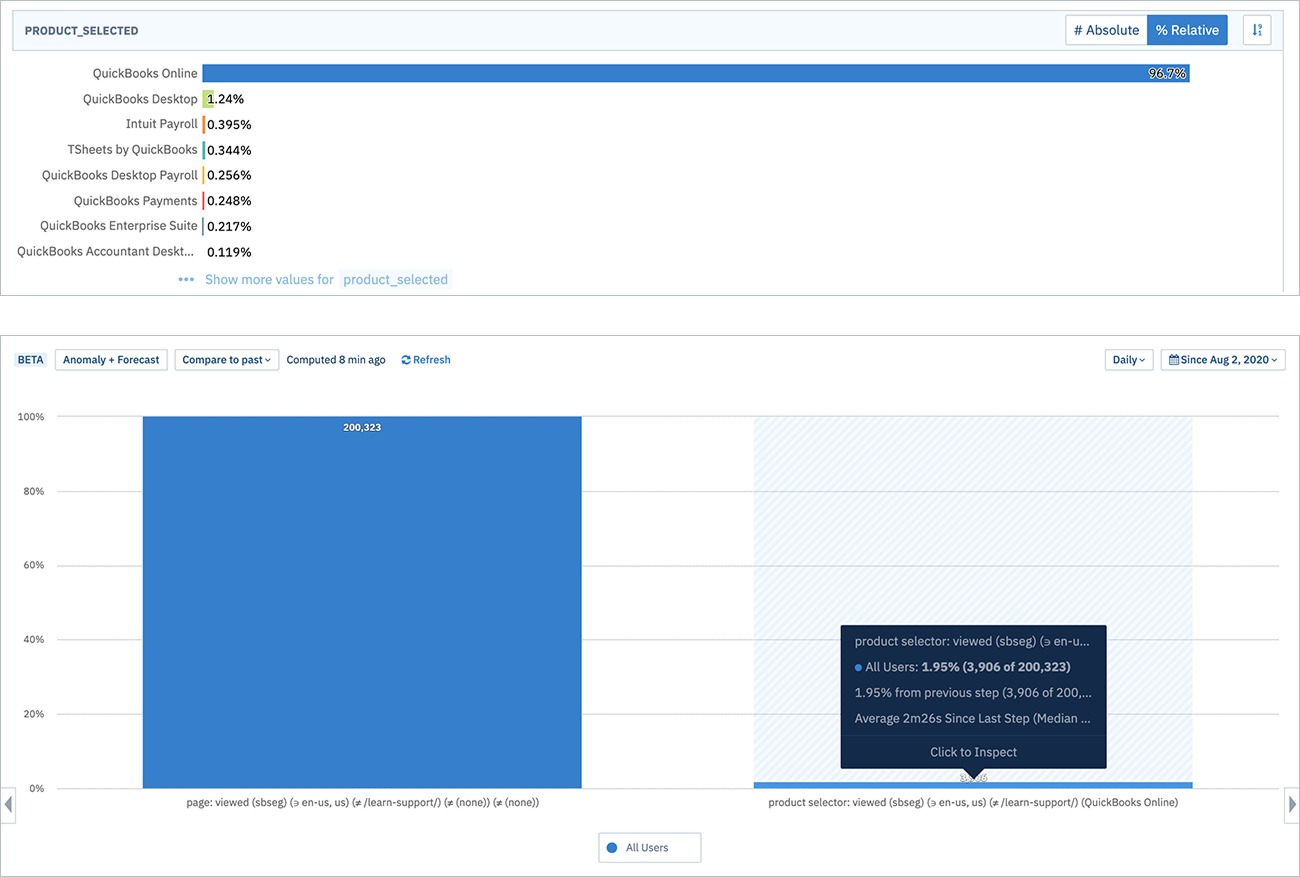
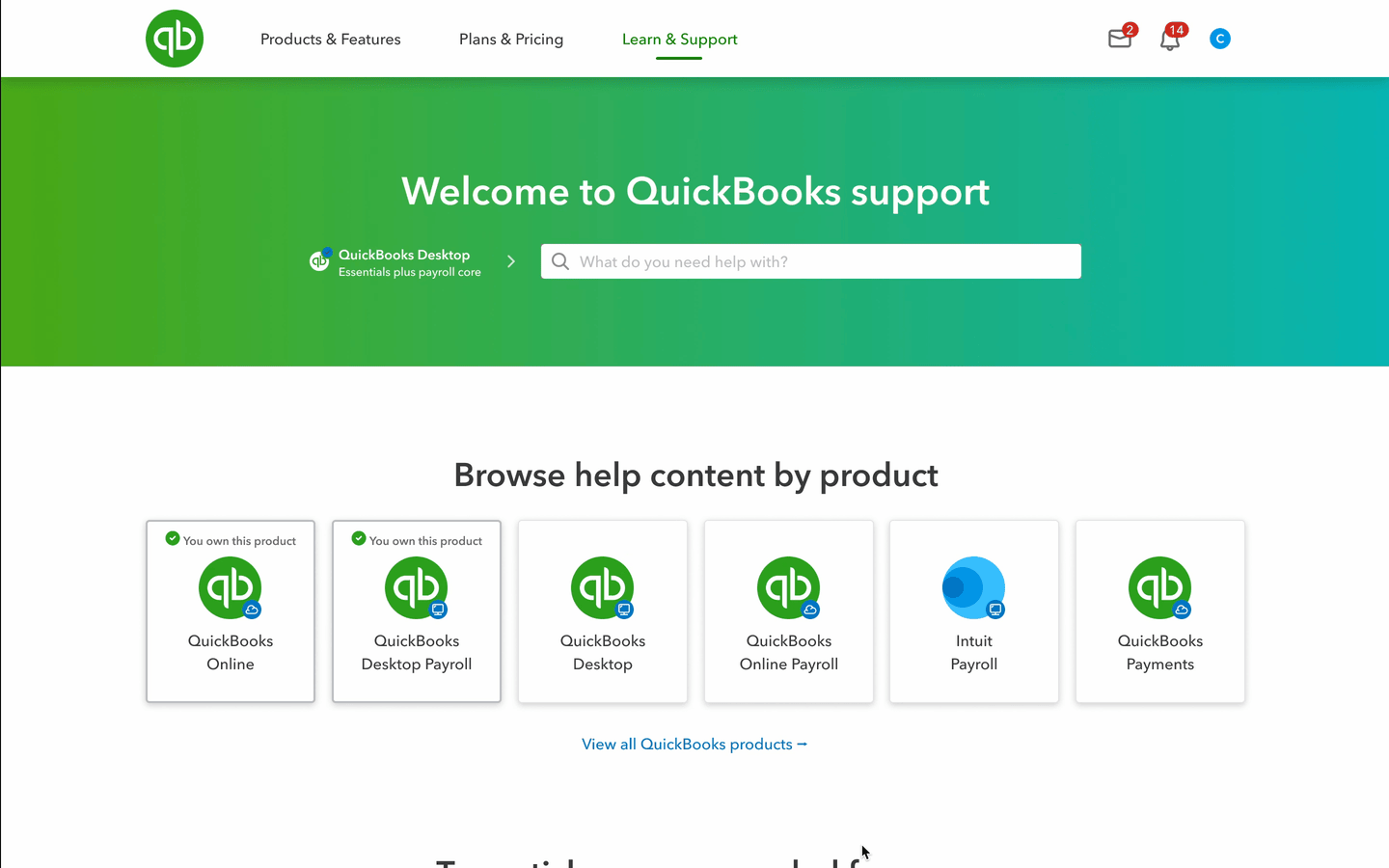
Only one product is preselected
QuickBooks Online is selected by default, leading to a 97% selection rate, meaning only 3% of customers actively choose other QuickBooks products. This default setting often directs customers to QuickBooks Online topic pages, even if they don't use it.
Furthermore, out of the 3% who click on a topic or use the product selector, only 2% switch to a different product in the dropdown menu.
Multiple Clicks on Products
Customers often click on products in the carousel multiple times, expecting a new page to load. They don't realize that the topic cards below the selector change based on the selected product.
Qualitative Research
Our customer research revealed that most users start with the marketing site, while others use external resources like Google, YouTube, blogs, and tutorials. We should add a 'Get Started' section on the marketing site to direct users to our support site. The product selector was often overlooked due to its lack of visibility and clarity. Customers also struggled to find specific products using the topic-first approach. For the Contact Us section, most users didn't scroll down to it and preferred finding contact links or phone numbers in the navigation. Some suggested a floating action button (FAB) for quick access to chat, contact, or a digital assistant. These findings highlight the need to improve the visibility and user-friendliness of key sections.
"It's not obvious, when I select a card, if I will be taken to an article or a page."
– Kimberly C.
"It doesn't make a ton of sense to be honest. Like, I mean, it just, it doesn't call to me to like click ... like as I like look over like topics. Okay. But it's going to just still be like clicking through to get to another thing to get to another thing."
– Ximena A.
"I don't know if finding a way to break it out a little bit more in design to draw attention. Cause then maybe I will click carousel, but I didn't notice it. I don't know why I didn't scroll down the screen."
– Matt H.
Internal support
Both qualitative and quantitative data clearly indicate that the user experience for out-of-product help is subpar, and customers are not engaging with the product selector. Fortunately, we have strong internal support from key stakeholders involved with the product support site. It's incredibly encouraging to see that other employees share the same passion for enhancing the customer experience.
Adopting a product-first approach will provide much-needed clarity. By allowing customers to first select a product from a dedicated product page and then choose a relevant topic, we can offer a cleaner, more consistent flow. Everyone is aligned with this strategy and recognizes it as a crucial step forward.
This change will have a significant impact on our bottom line. When customers can easily find the information they need, there will be fewer escalations, lower call rates, and substantial cost savings.
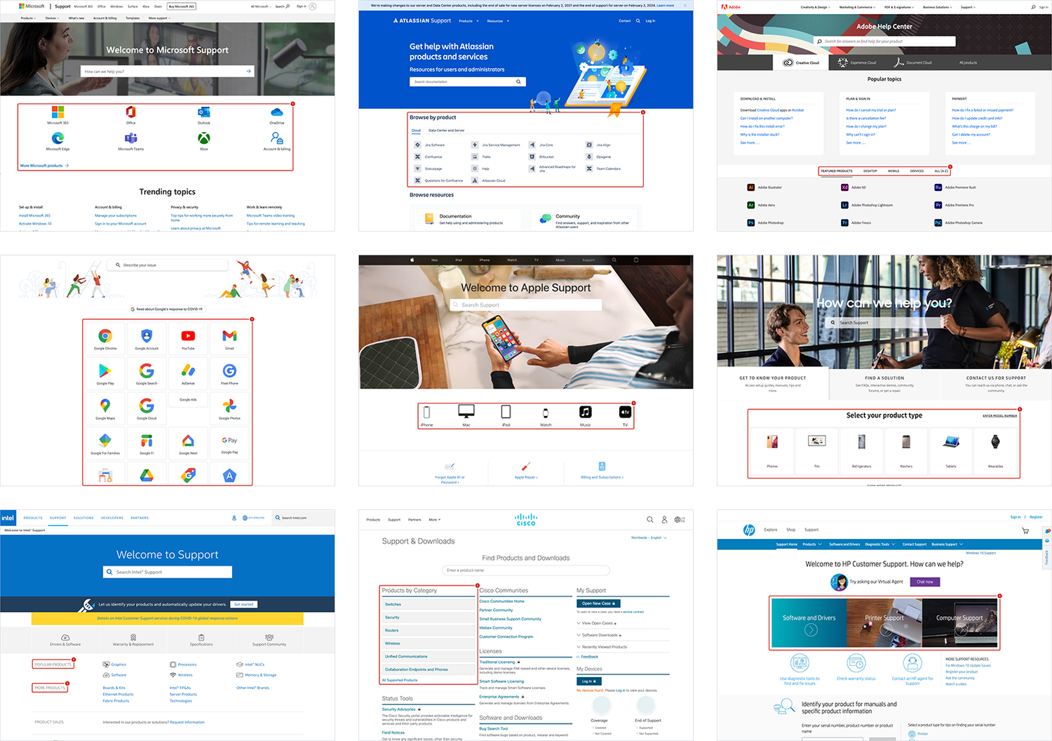
Competitive Analysis
I conducted a competitive analysis of several support websites compared to QuickBooks. Most companies prominently feature their products on the support homepage, often using logos or icons for easy recognition. For instance, Microsoft, Atlassian, Adobe, and Google use logos, while Apple uses icons, and Samsung groups products by type.
Clear navigation is also a common theme. Many companies provide a direct way to browse all products, such as Dell's button under the search bar, and Intel and Cisco's use of product categories. These practices enhance user experience and can be valuable for improving our own support website. None use a topic first approach.
Opportunities
The audit revealed issues with the hierarchy and the lack of a product-first approach. Having a product-first approach will address a wide range of customer issues.
New user flow
A customer lands on the support site to learn about timesheet management. They don't see their product on the product support homepage, so they click "View All." On the full products page, they find TSheets. The TSheets product page then displays a topic for timesheet management.
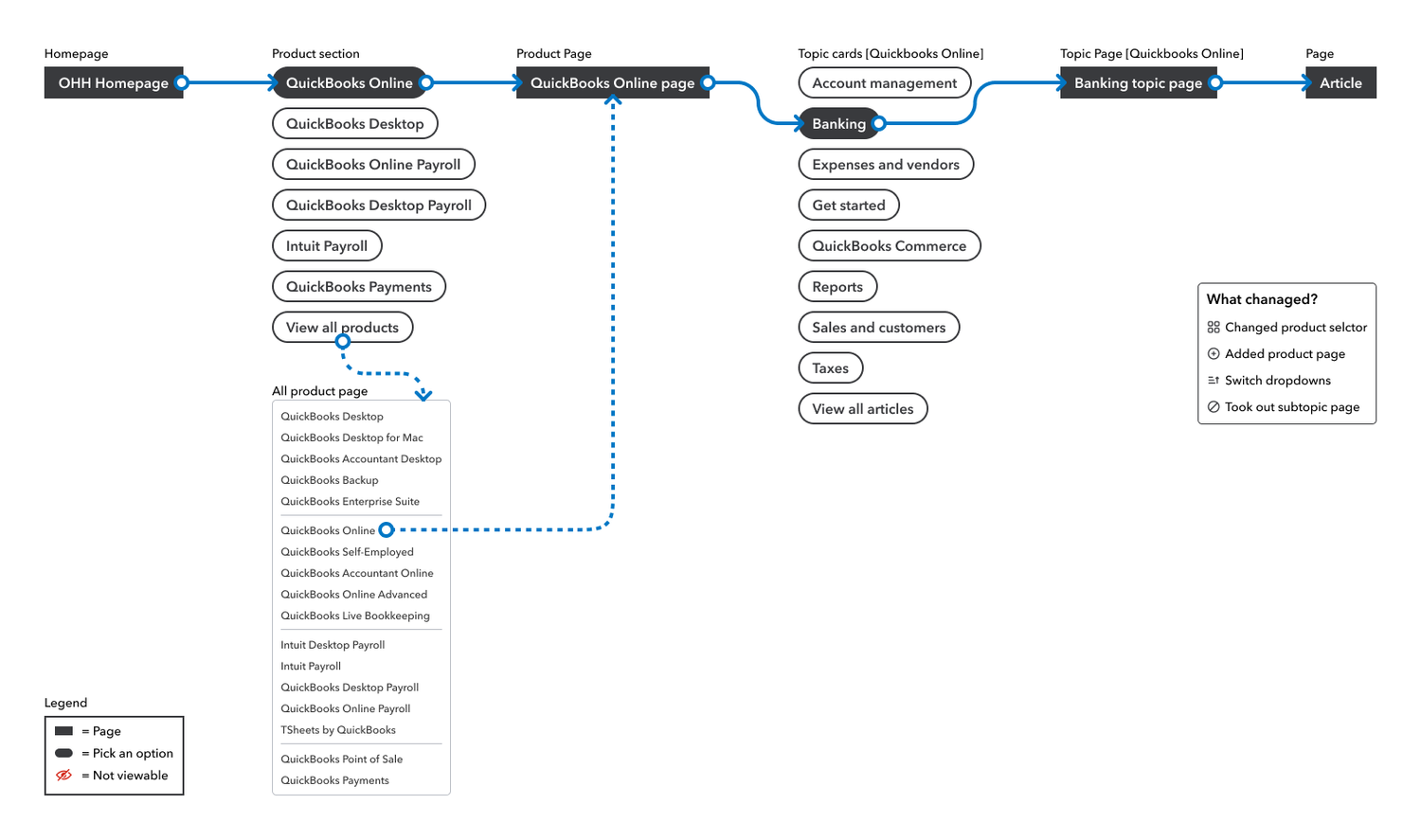
Wireframes and Prototypes
The wireframe presents a streamlined user experience where customers first select their product, then browse relevant topics without any hidden elements. This clear, step-by-step flow enhances confidence in choosing the right product for the help they need.
Benefits
- Remove the product selector.
- Display the top six QuickBooks products on the homepage with a link to view all.
- Remove topics from navigation.
- Product pages will show only relevant topics, with no hidden content.
- Eliminate subtopics to reduce clicks.
- The Product Topic page will list content (IGC/UGC/Tutorials) for the selected product and topic.

Moving towards rearchitecture
Customers are not interacting with the product selector and are confused by the topic-first approach, likely because the current design asks them to make a significant decision from a single section of the page. To address this, we need to shift to a product-first approach, making product selection the main focus.
Instead of continually patching the product selector, which is fundamentally flawed, we need to validate our hypothesis of a product-first approach. To do this, we will conduct usability tests comparing the current site with a new design that prioritizes product selection first. These tests will involve a series of tasks to identify user frustrations and confusion points. By analyzing the data, we can determine if the new approach improves customer retention and advocacy, reduces contact and escalation rates, and ultimately increases revenue.
Both qualitative and quantitative data clearly indicate that the user experience for out-of-product help is subpar, and customers are not engaging with the product selector. Fortunately, we have strong internal support from key stakeholders. It's incredibly encouraging to see that other employees share the same passion for enhancing the customer experience. This change will have a significant impact on the bottom line: when customers can easily find the information they need, there will be fewer escalations, lower call rates, and substantial cost savings.