CityU Website Redesign
Goal
Redesign City University of Seattle's website to better serve two core audiences: working professionals and international students. The previous site was outdated, difficult to navigate, and failed to communicate the brand's value or support the user's decision-making process.
My Impact
I led the end-to-end redesign, applying user-centered design methods including research, content audits, card sorting, usability testing, and high-fidelity prototyping. I collaborated across teams to define architecture, wireframes, and visual direction while ensuring accessibility and responsiveness.
What I delivered
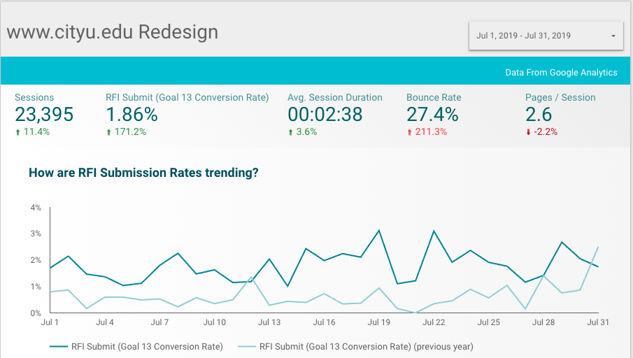
- 212.5% increase in RFI submissions within one week of launch
- 171.2% increase in RFI submissions after one month
- Usability improved significantly for both domestic and international users
- New structure boosted engagement across program-related pages
What is CityU?
Since 1973, City University of Seattle has been relentlessly reimagining higher education in the Pacific Northwest and around the world. As an accredited, private, nonprofit university, their mission is to provide career-relevant education to busy professionals who want to advance their careers and compete in the global marketplace.
Who is the audience?
Working Professional — CityU serves the working professional, an individual pursuing a promotion or career change while juggling family and a full-time job. The average CityU student is between 37–45, with 62% of their audience being female. These are working professionals potentially dealing with a desire for career shifting — they want to pivot to a different industry for various reasons. The CityU prospective student understands it might be hard, but refuses to be part of the pack.
International Student — The international student is a traditional college student in their beginning years of education, typically between 18–24. These students are go-getters — willing to do whatever it takes. Passion-driven and determined to succeed, these are individuals that need to feel surrounded by faculty who care about their future.
Why did CityU's website need a redesign?
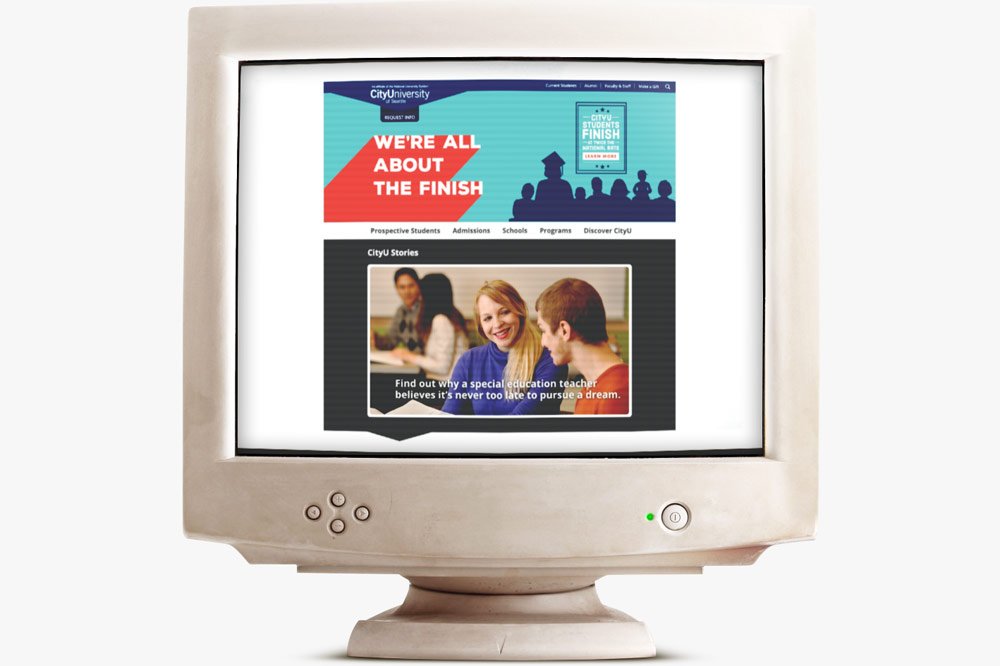
- Streamlining messaging toward the working adult — currently "all about the finish" leaves students feeling like the only thing CityU cares about is finishing their degree.
- Simplifying the UX experience — currently, unless you know what you were looking for, it's a struggle to find it.
- Revisiting content to be more concise with a more distinctive brand voice.
- Evolving design to be more modern, image-forward, and Seattle-focused.
Problem statement
I am... a prospective student exploring options to advance my career
I am trying to… find clear, relevant information about programs, admissions, and student support on the CityU website
But… the site is outdated, difficult to navigate, and lacks clear direction
Because… the content is disorganized, the flow is confusing, and the design doesn't reflect the needs of adult learners
Which makes me feel... frustrated, uncertain, and less confident in choosing CityU as the right fit for my goals.
Identifying problems in the current website
- No clear CTA
- Navigation menu is split and upside-down
- The website looks outdated with silhouettes (very 90s)
- The real brand value is not visible
- Not able to find program pages easily
- Color contrast violations — not WCAG compliant
- Flow hard to follow, no real hierarchy
- Old, outdated, and duplicative page/content (very bad for SEO)
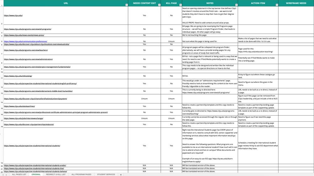
Content audit
As part of the redesign, we began with a comprehensive content audit to assess the volume, structure, and relevance of existing pages. This foundational step clarified what content needed to be removed, consolidated, or created — offering a clear view of the site's ecosystem and informing strategic redesign decisions.
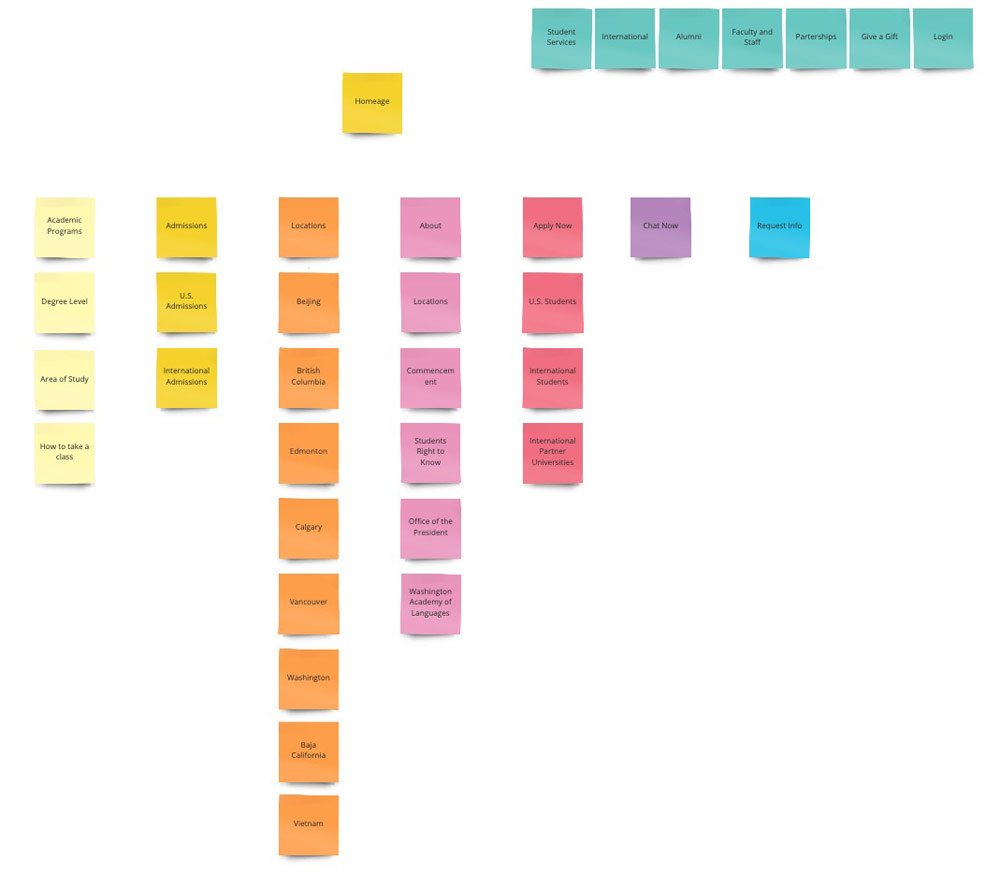
Information architecture through card sorting
We conducted card sorting exercises to guide the development of a new Information Architecture (IA). By mapping out the original sitemap and engaging stakeholders in collaborative discussions, we uncovered valuable qualitative insights and validated our IA decisions with user data.
Data-driven decision making
To complement qualitative insights, we analyzed site analytics to identify and prioritize high-traffic pages. This ensured that user-relevant content was preserved and elevated in the redesigned site structure.
User flow testing
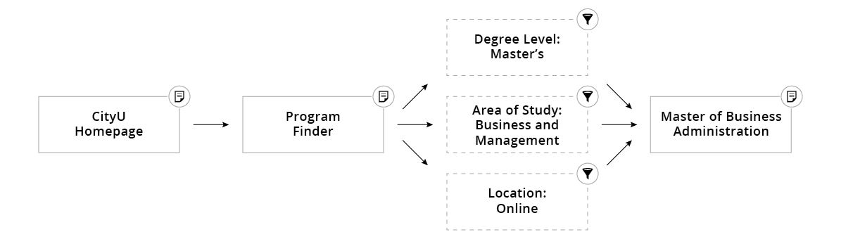
We created and tested user flows through task-based exercises. A critical task asked users to locate the MBA program as if they were prospective students. Testing exposed pain points in the original IA, which forced users to navigate through complex school and department layers that did not match user expectations.
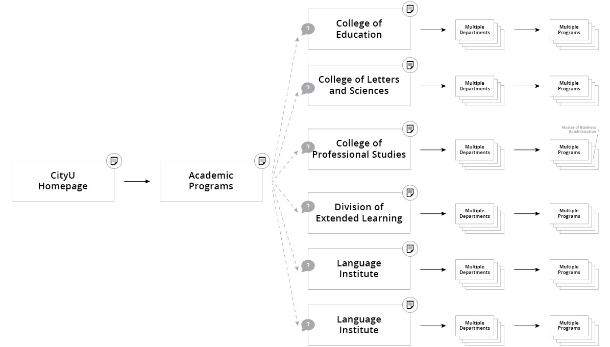
UX Solution: Area of study navigation
To resolve these usability issues, we reorganized the navigation using areas of study, a structure that aligns more naturally with how users search for programs. This change significantly improved task success rates and made the experience feel intuitive and user-centered.
Wireframes
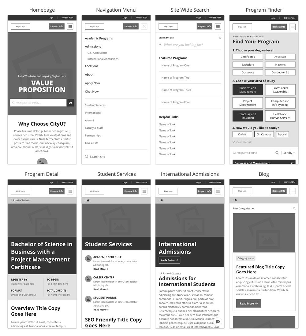
The team defined fourteen templates needed for development: Homepage, Menu, Search, Program Finder, Program Detail, U.S. Admissions, International Admissions, Student Services, Locations, Partnership, Blog, Blog Post, Catch-All w/ Side Rail, and Catch-All w/o Side Rail. I started with sketches, then moved into low-fidelity wireframes once the flow and content needs were clear.
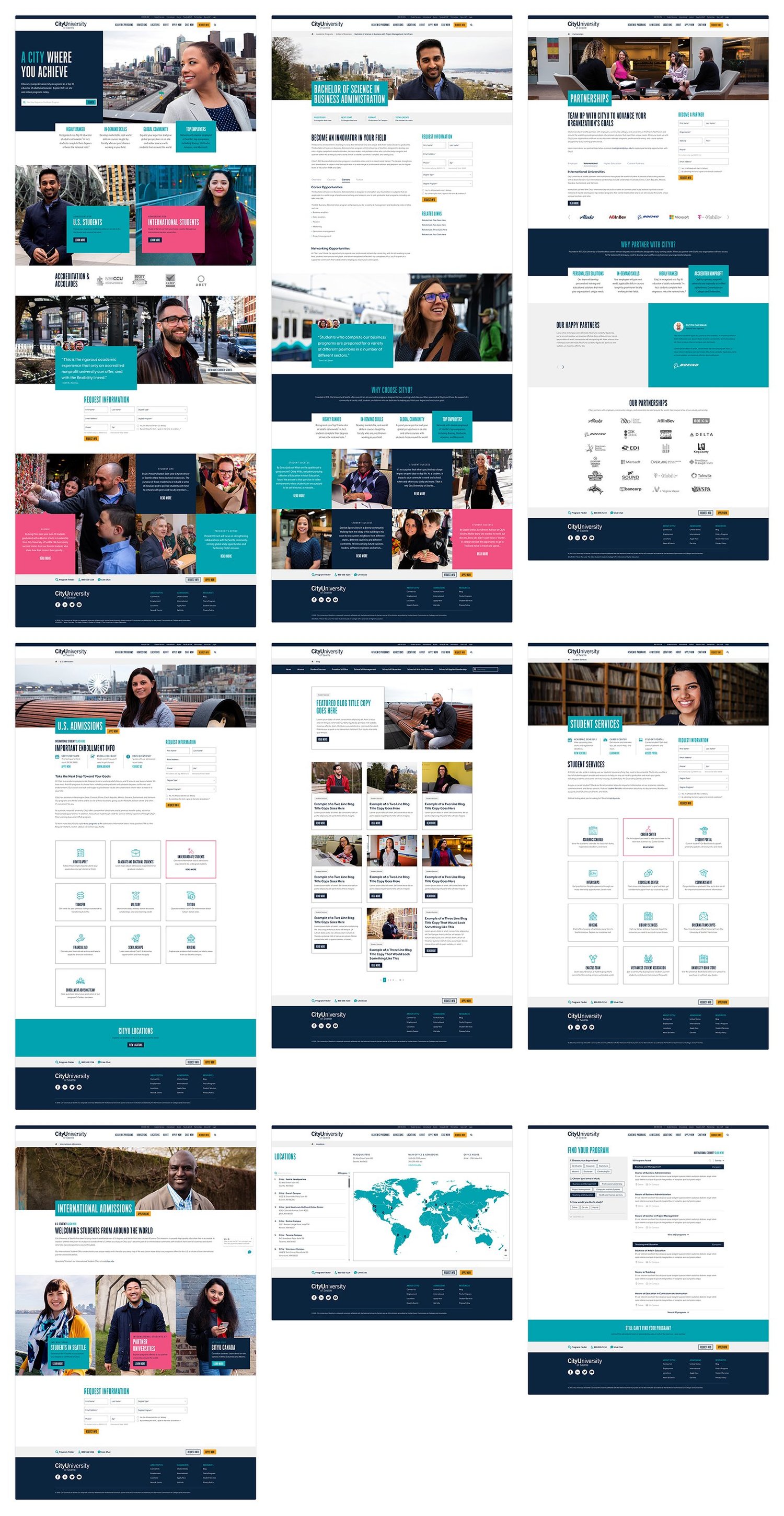
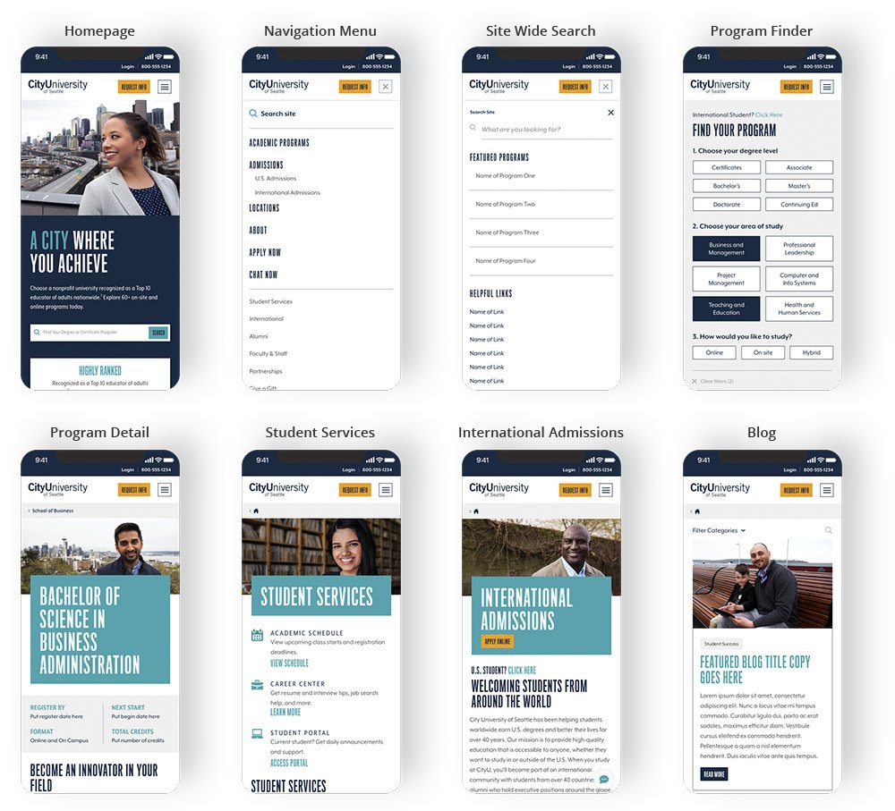
High-fidelity mockups
Once the wireframes were signed off by all stakeholders including development, more of the visual aspects were brought in through the brand style guide, part of a bigger project to launch a new brand campaign for CityU.
Usability testing
Since we knew the current site was underperforming, it was immediately clear the redesign would offer significant improvements. However, testing remained a crucial step. We conducted usability tests using task-based scenarios to validate our new user flows, ensuring users could easily find programs, submit RFIs, and understand CityU's value proposition. Internal stakeholders and real users provided feedback on high-fidelity prototypes, which informed final refinements before launch.
Validate live
With validated designs in place, we partnered closely with development to bring the new site to life. We focused on responsive design, accessibility compliance (WCAG 2.1 standards), and performance optimization. We provided detailed design specs, annotated wireframes, and collaborated in agile sprints to ensure alignment.
Launch impact
The new site launched in July 2019 and showed immediate impact. Our primary KPI — Request for Information (RFI) submissions — increased by 212.5% in the first week. Even after a full month, the gain remained strong at 171.2%. Navigation clarity, visual appeal, and content relevance contributed to improved engagement across key pages, validating our research-driven approach.
The launch was just the beginning
We adopted a continuous improvement mindset, using A/B testing and behavioral analytics to refine content, CTAs, and page layouts. Post-launch data continues to inform optimizations that drive user engagement and support enrollment goals.